Progression From AS To A2

How did you use media technologies in the construction and research, planning and evaluation stages?

In what ways does your media product use, develop or challenge forms and conventions of real media products?

In the above sound clip, I outline my initial thoughts of how I have progressed from AS to A2.

I personally feel that I have made substantial progress from the beginning of last year to this year. I began the course with a limited knowledge of most industry standard software packages or how to correctly frame shots to create an effective media text. Not only have I gained this knowledge, but I also learnt fundamental skills such as working within a team and meeting important deadlines. My research into the noir genre this year hs given me a sophisticated understanding as to the ideological motivations behind the director’s intentions to create their films they way they do. I would have never perceived a media text in this way before, despite having taken Media Studies at GCSE. I also never obtained such a sophisticated understanding of the horror genre either in my opinion and that is hopefully a testament to my own work this year to gain a wider interpretation of the repertoire of elements in the noir genre.

Thus, I feel that the production of the three media texts and the creation of this blog has been extremely important to the way I view the media and this will be a skill I can take with me beyond my A-Levels.

How We Made Our Film Poster (Photoshop)


How did you use media technologies in the construction and research, planning and evaluation stages?

As a group, we successfully created a professional looking film poster within Photoshop as part of our ancillary tasks to our trailer. In this post, I will be discussing the features of the software package that we used to produce the poster and why we made certain decisions.

Here is the original image we took of Caitlin (Rosette) to use as the basis for our poster. Whilst we tried other ideas, this post will focus on the production of this version of the poster.

IMG_1697

Firstly, we needed to refine the image of Caitlin so that we just had her mouth. To do this, we used the quick selection tool to select her mouth/chin area and then inverted the selection to be able to remove the top part of her face.

Screen Shot 2017-04-25 at 09.55.02

Next, we needed to manipulate her lips and cheeks to make them appear more plush and natural than they already were. We focused on the cheeks, to begin with. To make them appear smoother we used a combination of the clone stamp tool and the spot healing tool to take a sample part of her cheek that we wanted to replicate across her face.


Once we had perfected the cheeks, we needed to work on the lips to make them appear redder to conform the visual conventions of the Femme Fatale’s sexuality and danger. To do this, we used the brush tool and changed the opacity to 42% to make the change as minimal as possible. We chose the specific shade of red we wanted by using a specific hex colour (#8D271B). By keeping a low opacity to the paint brush, this meant that we did not lose the glossy feel to the lips and make it appear that we had just painted over the top of them.

We also needed to remove Caitlin’s teeth from the picture and this was achieved by using a very thin black brush.

Then, the final element of Caitlin’s face was to add a glow around her to make her appear like a more mysterious and angelic character. This was achieved by using the eraser tool around the edges that had been softened to give a smoother feel to the edges.

Screen Shot 2017-04-25 at 10.53.10

Screen Shot 2017-04-27 at 11.09.10

We then needed to add the smoke coming out of her mouth. To do this, we imported an image taken from the internet of some smoke in a PNG format (so there was no preexisting background). We then increased the hue of this image to make it appear redder to match Rosette’s lips.

Screen Shot 2017-04-25 at 10.50.54

Screen Shot 2017-04-27 at 11.09.36

We could then add some cobwebs around this by importing them into the Photoshop file. By selecting the image and pressing Cmd + T we could resize these to our satisfaction. We also used the transformation tool to rotate these cobwebs as well.

Screen Shot 2017-04-27 at 11.10.26

Screen Shot 2017-04-25 at 10.52.20

The last element was the titles. We downloaded a custom font (Upper East Side) from http://www.dafont.com and installed this to use within the Photoshop file. We could then use the text tool to import this and use as the title and tagline and adjusting it’s size accordingly.

Screen Shot 2017-04-27 at 11.10.46

For the credit block at the bottom, we downloaded a font called Steel Tongs which allows you to easily add a credit block to the bottom of the page.

Screen Shot 2017-04-27 at 11.34.52

Above is a screenshot of us producing the text is After Effects. This was used on both the poster and in the trailer itself.

Screen Shot 2017-04-25 at 09.07.55

This, in the end, produced the following poster. Whilst I understand it is not perfect, I feel as a group we can be proud of what we have produced.

How To Improve Our Media Texts

In what ways does your media product use, develop or challenge forms and conventions of real media products?

How effective is the combination of your main product and ancillary texts?

What have you learned from your audience feedback?

In these three videos, I tried to give an honest reflection of our media pieces and how I think they could be improved.

Focus Groups: Film Poster and Magazine Cover

What have you learned from your audience feedback?

We conducted some open-ended focus groups to gain some initial insight to our film poster and magazine cover.

Magazine Cover:

Screen Shot 2017-04-24 at 16.16.36

After posting out a link on social media to this focus group, we received some responses to gauge an initial reaction to the cover. It was clear that many wanted us to adjust the image of Andrew to make it look less photoshopped which was caused by a gaussian blur we had added to it. Many also felt that we should change the colour of the font of ‘Andrew Wills’ and make the below text (tug) larger and easier to read as well.

Sight & Sound v4

We then took this feedback on board and removed the blur, made the font white and made the tug larger as well. This small focus group was, therefore, useful in gauging an initial reaction to our piece allowing us to make said improvements to it.

Film Poster:

Screen Shot 2017-04-24 at 16.04.29We then proceeded to use the same method of feedback for our poster. This indicated to us that we should improve the tagline, make some adjustments to the lips/mouth of Rosette to make it appear more streamlined and improve the spider webs around the smoke.

Screen Shot 2017-03-29 at 15.15.46

We then made changes accordingly. Whilst we did not change the cobwebs as we felt there was not much we could do to improve it any further. However, we did change the tagline to have a direct correlation with the web that Rosette spins. We also went back and refined the lips in Photoshop to make them look more realistic and plush. Once again, focus groups made this clear to us and we were able to act on this feedback accordingly.

The Widow’s Web: Survey Responses (Qualitative Feedback)

What have you learned from your audience feedback?

Following the creation of our trailer, we put out a quantitative survey for some randomly selected audience members to answer via social media. Here are the responses we received.

Screen Shot 2017-04-29 at 16.44.02.png

Screen Shot 2017-04-23 at 11.23.20

The vast majority of the responses we received for our film were positive ones. Many people felt that it was a good introduction to the film. The audience correctly identified that the start of the trailer was meant to be slower in pace and act as an introduction (exposition) to the plot of the film. Thus, it would appear that we have been successful in our task to make an audience want to see our film so far.

Screen Shot 2017-04-23 at 11.23.33

Screen Shot 2017-04-23 at 11.23.41

Following this set of feedback we received, it is clear to see that the vast majority of the audience have a good understanding of the plot of our film. Many have correctly identified that Mark is the main protagonist (a journalist) and that his friend/colleague, Hans is killed by the Black Widow. Whilst some have differentiated Rosette from the role of the Black Widow, all have identified her as evil and many claim that she killed both Hans and Mark. However, importantly, many also believed that Hans had committed suicide which shows that we have been successful in creating an ambiguous trailer so the audience will watch the full film to find out the truth. There has been a slight error from some people in claiming that the character of Mark is a policeman or Rosette has killed a string of people. These are not quite correct and this may mean we have to go back and make the job role of Mark slightly clearer.

Screen Shot 2017-04-23 at 11.23.54

Many people were also along the correct lines when asked the genre of our film. 4/15 correctly said that it was a noir and many also felt that it was either a thriller or crime film; which are close synonyms to the nature of noir, especially if the audience didn’t know the correct terminology for the genre. There was one response that claimed it to be an action film- but this in the minority so we can perhaps discard it.

Screen Shot 2017-04-23 at 11.24.00

There was a wide range of what people identified as their favourite part of the trailer. Quite a lot seemed to stem from the pace of the editing alongside the fast-paced music. Thus, we can learn from this that there are many good elements of our trailer that we can be proud of.

Screen Shot 2017-04-23 at 11.24.11Screen Shot 2017-04-23 at 11.24.17

Perhaps, the most important part of this survey is asking people what we could improve about our trailer. Most comments seemed to centre around the cinematography of the trailer. Some felt that shots were either too shaky or too dark. Both of these statements upon reflection, are quite possibly true and may be something that we look at in another round of post-production. Other people felt that some parts of the plot of the film were too obvious or the acting was poor. The latter is something that we just have to accept as down to people’s individual taste, whereas the former can be linked with what people said when we asked them for the plot of the film. As this audience member stated, the plot may be too obvious and the fact that many correctly identified it in the survey can be used to back this statement up. There is a fine balance between making the plot easy to follow for the audience and giving away everything that happens in the film. I personally feel, due to some people believing that Hans committed suicide- or not realising that it was in fact Rosette killing Mark that we do still have a narrative enigma to work with. The final area that some felt we should work on was the music. Some felt it was too loud or the transitions could be improved- this is something we will take on board and look to improve next time.

So the final takeaways from this feedback are as follows:

  • The plot is clear and easy to understand (perhaps too clear)
  • The genre is mostly correctly identified
  • The music is good but could be fine-tuned
  • The acting is subjective but not universally approved of
  • The shots could be stabilised and brightened (although noir is meant to use low-key lighting within the genre- but we can still improve this)

Therefore, this survey has been a useful exercise for us to reassess the quality of our trailer from the perspective of a neutral audience.


Linking To The Quantitative Feedback:

Both of these surveys revealed some mixed reactions from the audience. Both highlighted to us that the key areas to improve were the cinematography and music. We then learnt from the qualitative feedback that this was specifically the music transitions and the lighting within the shots. We also learnt from the qualitative feedback that the vast majority of audience members received a preferred reading of the text, so when people said in the quantitative feedback that they understood the plot, that was most likely true. We can also link the positive responses from both groups to understand that, this film ought to be successful if put on a mainstream release. This would help us if we were to make further iterations of the trailer.

Institutions and Distribution For Our Trailer & Linking To Ancillary Tasks

How effective is the combination of your main product and ancillary texts?

Screen Shot 2017-05-04 at 14.41.01

LINK: http://prezi.com/mfm8bcs3nfxv/?utm_campaign=share&utm_medium=copy

Here is a presentation that outlines how our choice of institutions and distribution companies affect the outcome and marketing of our trailer.

I also made a short video, in which I discuss how the different media texts we produced relate to their own individual industries.

One link between our magazine cover and the trailer is the urban setting. Our director, Andrew Wills is stood by some graffiti on the wall which links to the scenes in our trailer of Mark investigating the case in an urban setting.

Another link is the use of costuming. Our director, Andrew Wills is dressed to mimic a trench coat as seen with Mark Rivers in our trailer. This is a conventional costume that is used within the noir genre as worn by the fall guy during his investigation to uncover the corruption within the urban setting.

However, it is important to note that whilst our director dominates the majority of the cover, the tug at the bottom is focused on promoting other films and content in the magazine. Whereas the trailer’s sole purpose as a media text is to advertise our film- thus showing that the magazine cover has numerous purposes rather than our trailers single role.

There are also several intentional links between our poster and our trailer. The first being the use of smoke which can be seen in our trailer with the close-up profile shot of Rosette. Cigarette smoke is a common visual convention in noir and symbolises the mysterious and seductive elements of the femme fatale character.

Our poster plays heavily upon this idea of the femme fatale; using her mouth and the dark red lipstick to connote her sexuality and the danger that she possesses if a character is drawn in too close by her. This is also seen in our trailer through the use of costuming with her red dress and her demeanour towards Mark. Whereas the trailer is more focused on the character of Mark, as he is the one the audience see the perspective of the world from yet he is not seen on the poster. This demonstrates that the trailer is trying to sell the audience the narrative of the film whereas the poster is focused on promoting and selling the genre. This is because the genre is inferred through the cinematography of the trailer but there is only so much a poster can communicate as a single image. Therefore, instead, the poster has to rely on the use of semiotics where the imagery of the signifier acts to create a message in the audience’s head known as the signified.

Screen Shot 2017-03-31 at 13.12.34.png

Thus, it is clear to me that the design of our magazine cover and poster are appropriate in the context of our trailer. These media texts serve a genuine purpose in advertising to the audience and acting as a symbiotic tool that is beneficial for both the production and distribution company.

Quantitative Feedback

What have you learned from your audience feedback?

Whilst producing our trailer, we also made a SurveyMonkey with some closed quantitative questions for audience members to answer. We asked 20 people at random, some of whom are in our target audience whereas others were not. Therefore, it is important to note that these people will have a limited understanding of the genre of noir (which is a more niche genre) and their understanding may be slightly less developed than my own. Here is what we found.

1

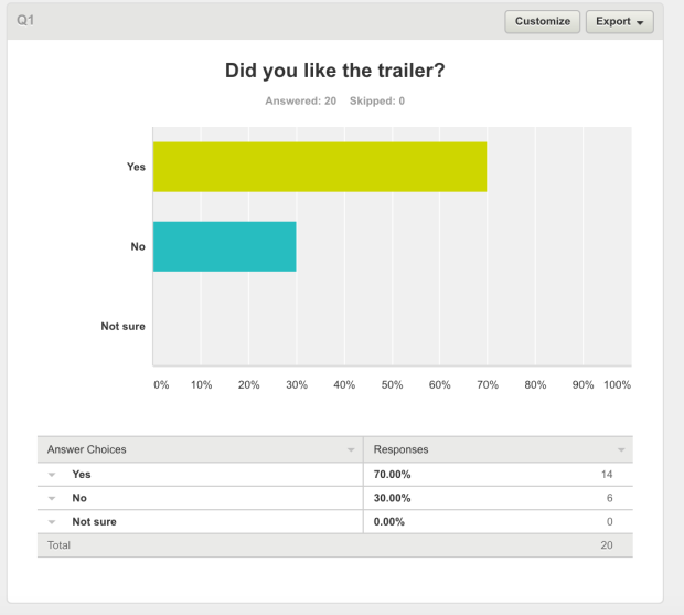
Firstly, 70% of our respondents reported that they liked our trailer. This is always a good thing as the purpose of any trailer to advertise a film to an audience. Whilst six people did answer that they did not enjoy the trailer, further questions will perhaps demonstrate as to why they felt like that, but it was always very unlikely for it to please everyone.

2

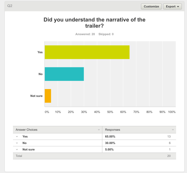
Again, an overwhelming majority of people reported that they understood our trailer. However, there is a danger here that they may have understood their own negotiated reading of the text, but this may not reflect the plot which we have created ourselves. However, if this conforms to the same results that we will attempt to uncover in our qualitative results then this will not matter so much.

3

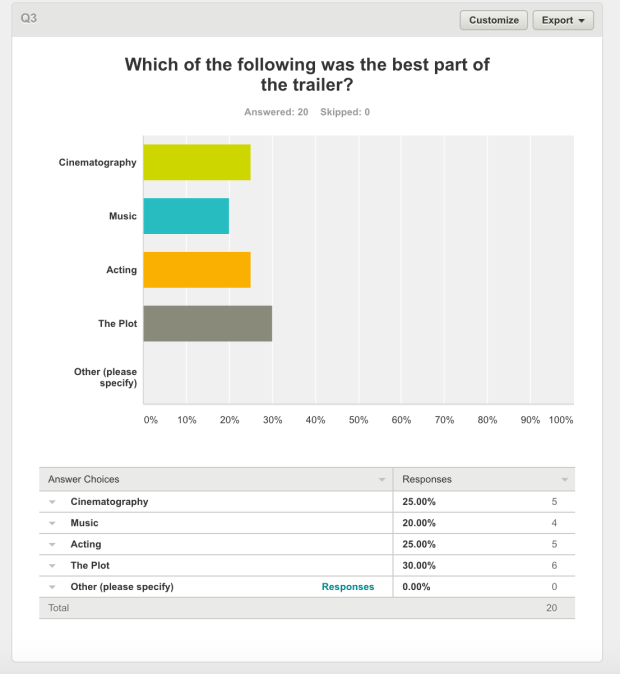
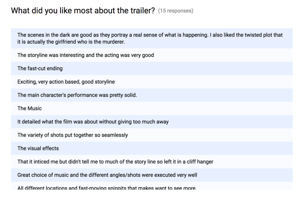
It is clear that our trailer has numerous different selling points to the audience. There was an almost even split amongst people as to what their favourite part of the trailer was. However, the plot came out just on top which is arguably the most important part of any film/trailer, as it could look appealing but if the story is not engaging, then no one will go and see it!

4

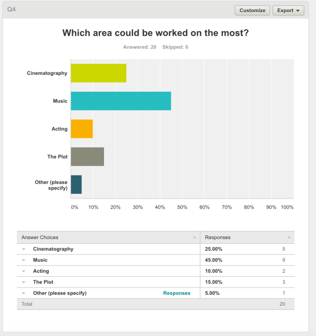
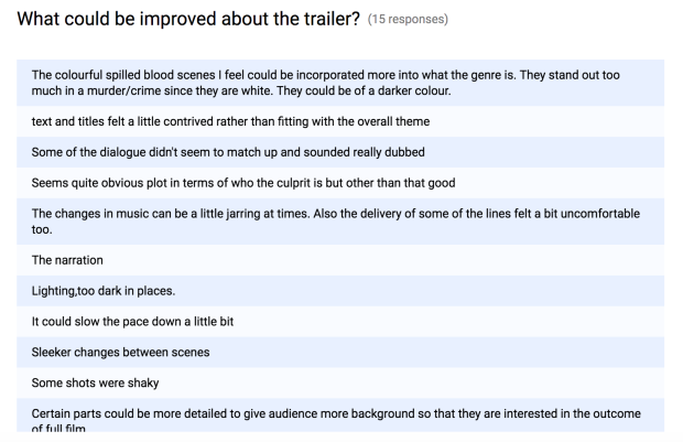
There was more consensus when it came to what people believed we should work on. Here it was stated that the cinematography and music were the main key things to improve. In our qualitative feedback, we will be able to discern exact reasons as to how these could be improved.

5

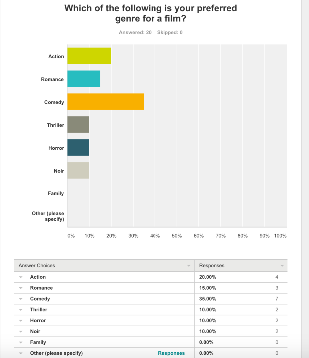
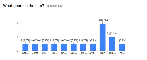
We also asked some sub-questions to gain an insight into the mindset of our audience. When asked what their favourite genre of film was, 35% answered comedy, with noir only receiving two votes. However, it is important to consider that noir is in itself a niche genre meaning that our film is targeted at this small 10%. If we can maintain a consistent understanding of the noir repertoire of elements along with some sub-elements of comedy and action films, then we can appeal to the widest audience.

6

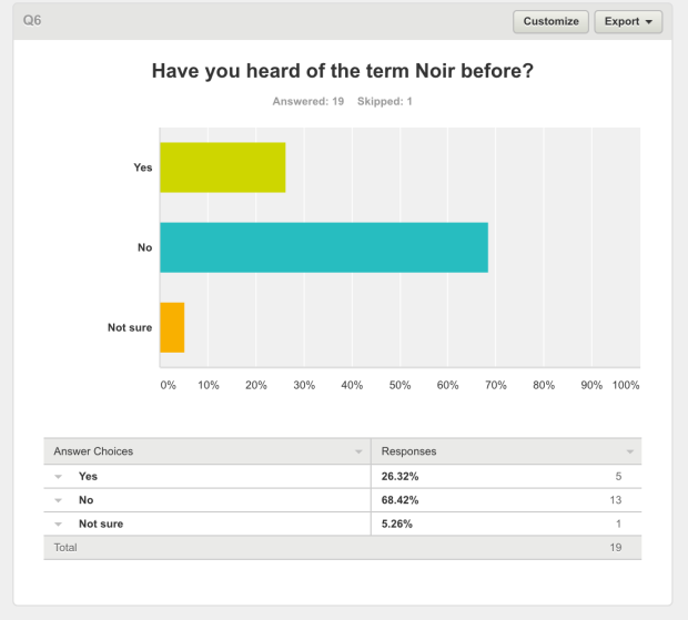
The response to the previous question is largely backed up by our following question with 68% of people never having heard of noir before. This is likely due to its obscure nature as a genre, although audience members may have seen a noir film before but just not have realised it.

7

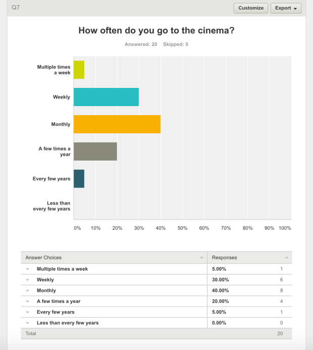
We were also able to determine that many of our audience will go to the cinema either once a week or once a month (on the whole), this therefore would mean that our film would have a good chance of succeeding at the box office if it were to go on a mainstream release.

8

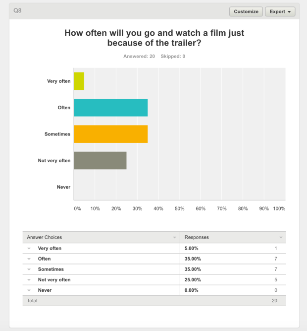
We were also able to discern that a significant number of the public will go and see a film based on its trailer. Therefore, this means that our film is likely to succeed if we can produce the trailer to a high enough quality.

9

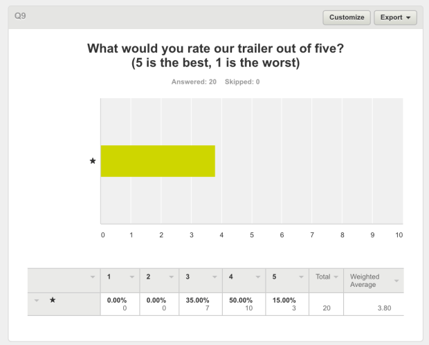
We then asked for people to rate the trailer out of five. We received an average 3.8 rating, which is probably a number that could be improved further. Thankfully, no one thought our trailer was worse than 3* and some did give it 5* showing a range of mostly positive opinions.

10

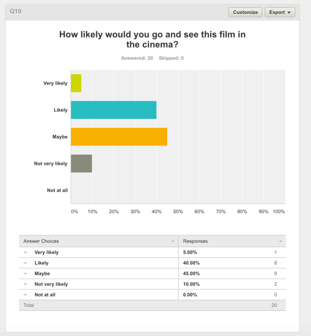
We then looked to see how much appetite was generated by this trailer to see the full film, i.e if it did its job correctly. A considerable number of audience members chose to be rather tentative at this stage. This could be due to the fact that we didn’t directly target our primary audience of 25+. If we were to do this again, hopefully, the results would be more weighted towards ‘very likely’.


Therefore, from this exercise, we have obtained feedback on what areas need to be improved for our trailer and how it would be received on a mainstream release. We will now go about conducting some qualitative feedback to link back to these original findings.
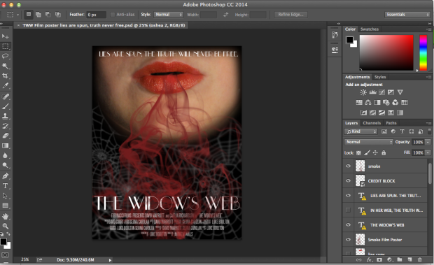
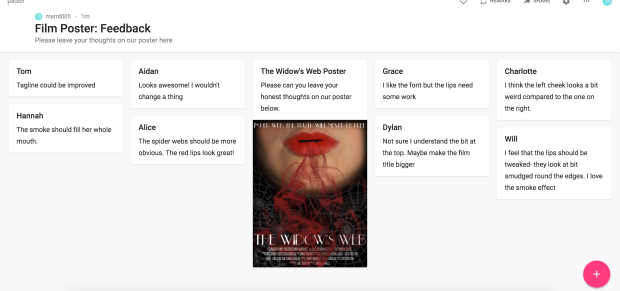